
Introduction
Chimera UI is a free and open-source UI library built for React + Tailwind. Some of the key features/benefits of Chimera are:
- Customize with Tailwind - No need to learn a UI library specific API, just write the Tailwind you already know.
- Semantic Color system built in - Components come pre-styled with this color system, allowing you to use the components across projects with different styles without having to re-write styles.
- Theme generator - Define all of the colors in the color system in seconds.
- Importable components - Tailwind UI libraries tend to be copy & paste.
Although no part of Chimera is a new idea or anything special on its own, I believe that putting them altogether provides an awesome developer experience. But hey, maybe I’m biased. Let me walk you through it, and tell me what you think.
Color System
Intuitive Semantic Color Names
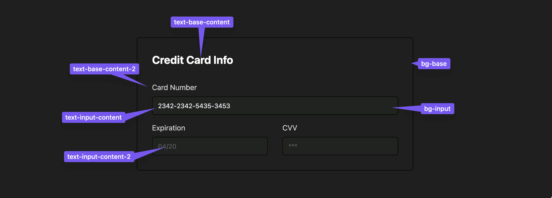
Let’s say you’re styling a <CreditCardForm>. Your background color should be base. Since the heading is a color that sits on top of base, you would use base-content.

That’s great, but two colors won’t do it. Turns out you actually need more quite a few colors to make something look good! Adam Wathan and Steve Schoger talk about this in a preview of their book, Refactoring UI.
To make it look right, the input background should stand out slightly from the background, and the labels should be a little dimmer than the header. That’s where color modifiers come into play.
Color modifiers provide a lot of depth but are easy to remember
In Chimera’s color system, every color has modifiers. Using base (the main background color) as an example, you would use:
base-contentfor text on top of base
base-content-2for text that is less prominent than base-content
base-focusfor focus/hover states of elements withbg-base
Chimera Components
Chimera Components = writing less styles
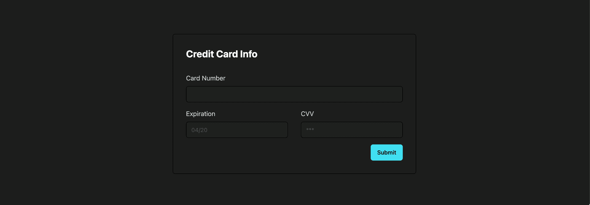
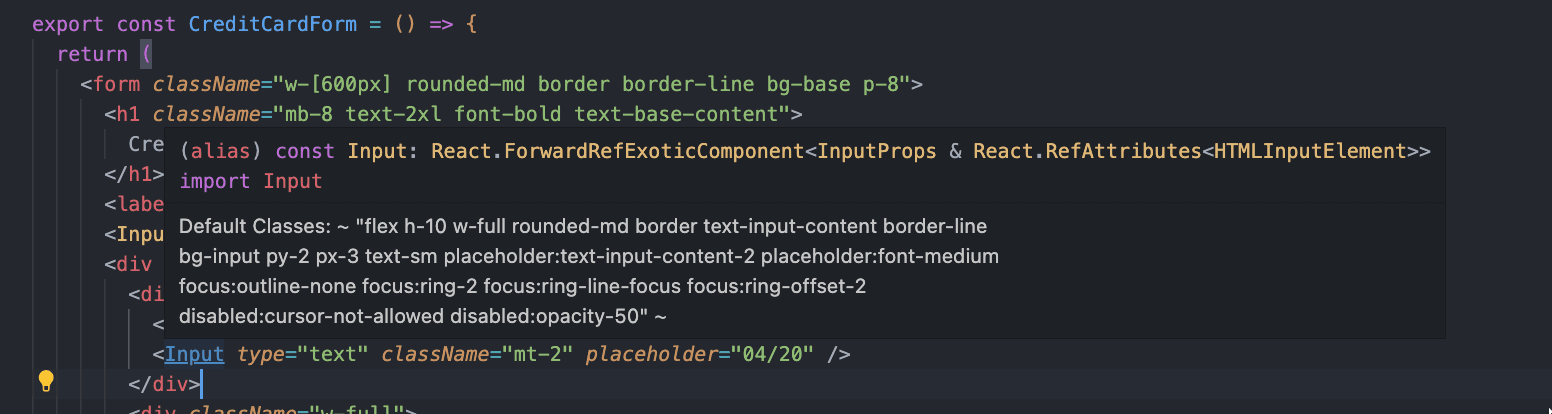
Now we add a <Button> . Notice in the code that we don’t have to write much styling. All we need is <Button className="float-right mt-4">Submit</Button>.
import { Button, Input } from "@chimera-ui/components";

export const CreditCardForm = () => {
  return (
    <form className="w-[600px] rounded-md border border-line bg-base p-8">
      <h1 className="mb-8 text-2xl font-bold text-base-content">
        Credit Card Info
      </h1>
      <label className="text-base-content-2">Card Number</label>
      <Input type="text" className="mt-2" />
      <div className="mt-4 flex justify-between gap-8">
        <div className="w-full">
          <label className="text-base-content-2">Expiration</label>
          <Input type="text" className="mt-2" placeholder="04/20" />
        </div>
        <div className="w-full">
          <label className="text-base-content-2">CVV</label>
          <Input type="text" placeholder="***" className="mt-2" />
        </div>
      </div>
      <Button className="float-right mt-4">Submit</Button>
    </form>
  );
};
That’s because the Button already comes prestyled with "bg-primary text-primary-content hover:bg-primary-focus". You can see it here in the source.
Customizing Components
To customize components, you don’t need to learn another library or API. It’s as simple as writing Tailwind like you would anywhere else.
<Button className="bg-purple-500 hover:bg-purple-200">Submit</Button>Chimera uses tailwind-merge under the hood to resolve style conflicts with Chimera’s defaults.
Usually you don’t really need to think about what the default styles are, you can just write whatever you want the styles to be. But sometimes you might be wondering what styles are actually applied. Chimera exposes these styles in intellisense, so can hover over any component to see all of the styles you can override.
Themes
The easiest themeing experience ever!
Here’s my favorite part about Chimera. It’s SO easy to theme. Let’s say we want to use that same <CreditCardForm> in another project, one that has completely different brand colors. With libraries like Tailwind UI or Flowbite, you’d have to update all of the colors. But with Chimera, you can re-use the same JSX and the component will pick up the site’s colors automatically.
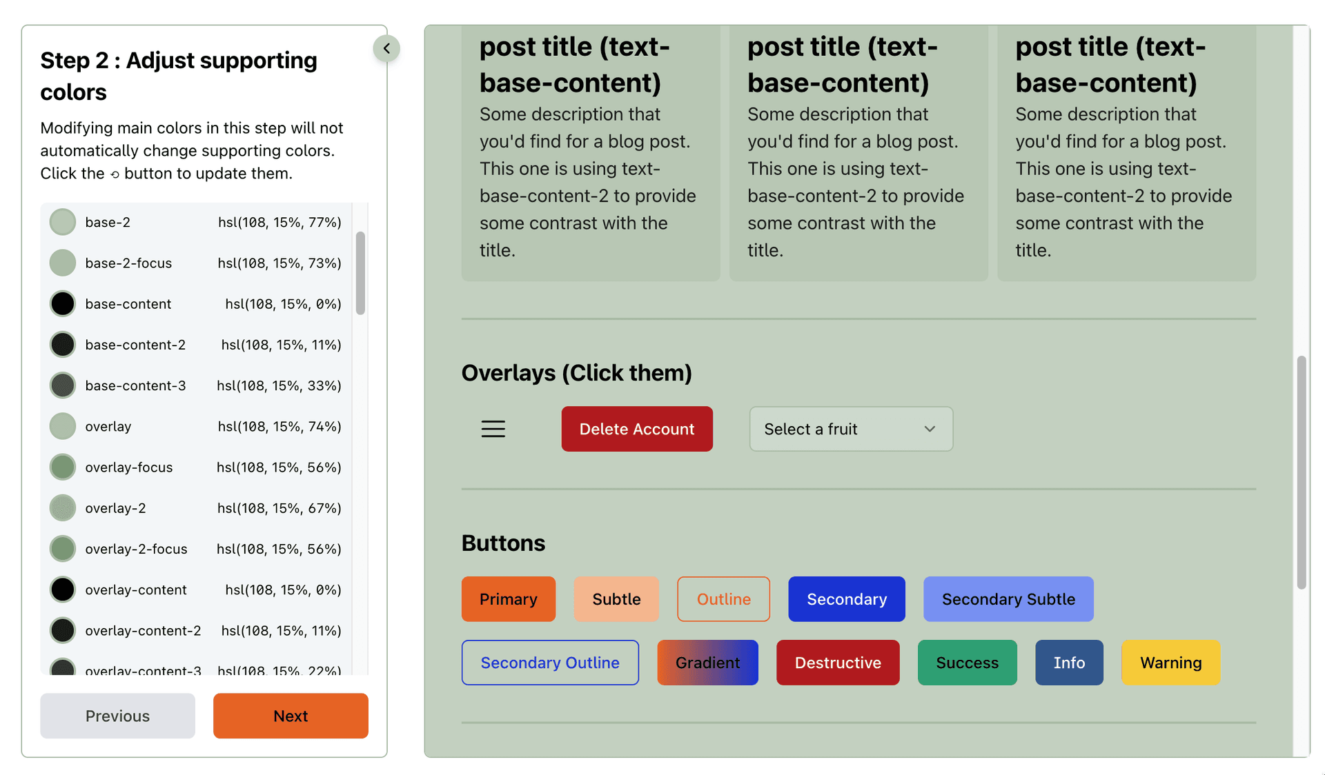
To define the site’s colors, you just go to Chimera’s Theme Generator and pick your colors. In this example, I only needed to pick base, primary, and secondary
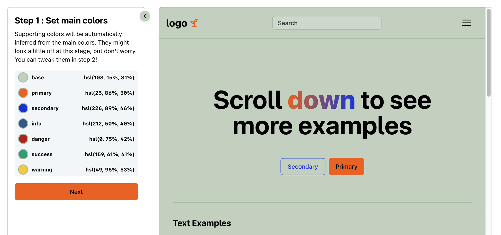
The theme generator automatically picks the supporting colors such as base-content and base-focus, but it gives you a chance to tweak them as you see fit. I think it did a good job, so I’ll keep going.
Last step! It generates some CSS for me to paste into my CSS file.
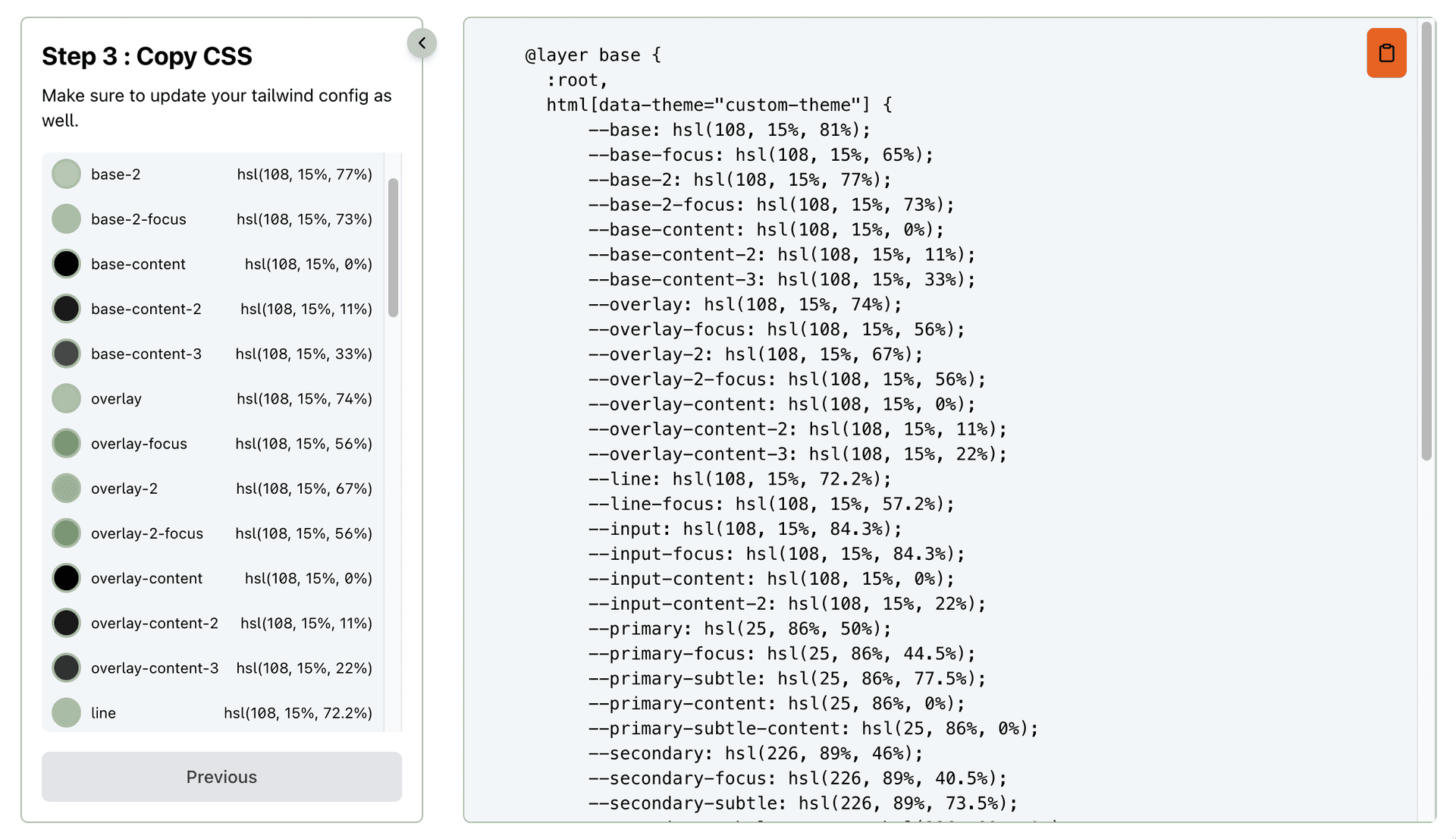
Boom! As soon as I drop those styles in, any components using the semantic color system will inherit those colors automatically. If you’re curious how it works under the hood, you can learn more here.

Theme Switcher
You can easily add a theme switcher to support light/dark mode, or even multiple themes. All you need to do is update the data-theme attribute on the html tag to match whatever you named the theme in your CSS file.
For Next.js, next-themes makes that super easy. You can read a more detailed walkthrough here.
Conclusion
I would absolutely love it if you give Chimera a try. If you love it, great. If you don’t, please tell me why! I’d love to keep making this library better, and to do that I’ll need your feedback. Thanks for reading!